The MVP metrics investors care about after launch are the ones that prove real behavior: activation, retention, conversion, engagement depth, cohort quality, customer feedback quality, and learning velocity. Signups, downloads, traffic, and demo praise may give useful context, but they do not show whether the product is becoming important enough to fund.
That distinction matters because an MVP is not a miniature finished product. It is a market test with working software around it. The post-launch question is not “did we ship?” It is “what did real users do, what did they repeat, what would they pay for, and what should we change before spending more money?”
CRV’s guide to the MVP stage of a startup makes the same point from an investor lens: pre-validation is the problem, not pre-revenue alone. A seed-stage product does not need polished enterprise economics, but it does need evidence that a specific customer segment cares enough to act.
If you are still before launch, start with a product validation framework so the MVP is designed around the riskiest assumption. If you are already seeing repeat usage, compare the signal with Hapy’s guide to SaaS product-market fit. If the product has launched and the next build cycle is unclear, use the post-MVP roadmap to turn the data into product decisions.
Why MVP success metrics should guide the next decision
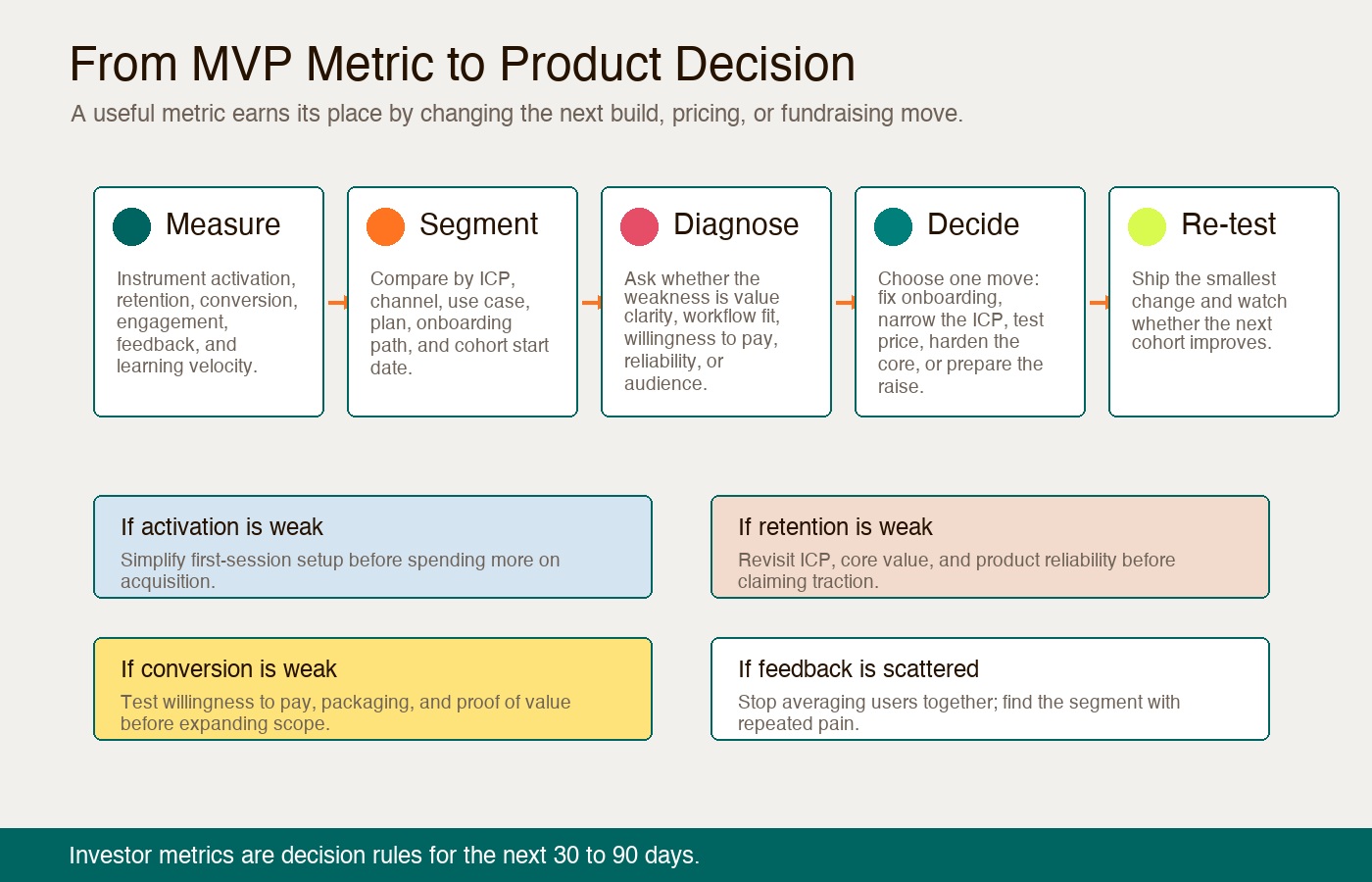
Good MVP success metrics should change what the team does next. A metric that looks impressive but does not affect onboarding, pricing, retention, roadmap scope, or fundraising readiness is probably decoration.
The Lean Startup idea behind an MVP is validated learning: release the smallest useful product, measure real customer behavior, and decide whether to persevere, pivot, or narrow the bet. Investors are looking for that same discipline. They want to know whether the team can learn faster than it burns runway.
That is why vanity metrics are risky. Total users can rise while the product is quietly failing. A waitlist can grow because the promise is interesting, not because the workflow is urgent. A demo can get praise from people who will never switch, pay, or return.
Use each metric as a decision rule:
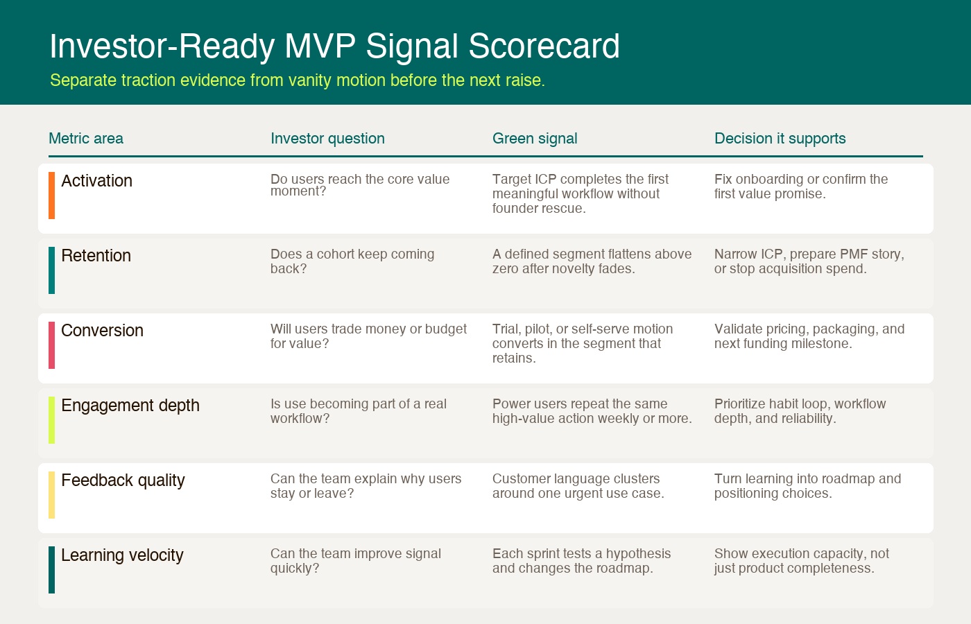
| Metric | What it proves | Decision it should inform |
|---|---|---|
| Activation | Users reach the first meaningful outcome | Fix onboarding or confirm the value moment |
| Retention | A cohort returns after novelty fades | Narrow the ICP, improve core value, or prepare PMF story |
| Conversion | Users accept a real value exchange | Test pricing, packaging, sales motion, or paid pilots |
| Engagement depth | The product is becoming part of a workflow | Prioritize habit loops and high-value actions |
| Feedback quality | The team understands why users stay or leave | Shape roadmap, positioning, and segment focus |
| Learning velocity | The team can close loops quickly | Show execution quality and runway discipline |
Activation shows whether users reach value
Activation measures whether a user experiences the product’s core value for the first time. It is usually the first investor metric for MVP traction because it separates curiosity from product comprehension.
For a B2B SaaS MVP, activation might mean creating the first project, importing useful data, inviting a teammate, configuring a workflow, or generating the first report. For a marketplace, it might mean posting a listing, booking a service, or completing the first transaction. For a productivity tool, it might mean completing the first task that the product promised to make easier.
The activation formula is simple:
Activation rate = Eligible new users reaching the value event within the window
                  / Eligible new users with a complete observation window
The hard part is defining “activated” honestly. A user who creates an account has not activated. A user who clicks around the dashboard has not necessarily activated. Activation should be tied to the first moment where the product delivers its promised outcome.
Investors care because weak activation usually points to one of four problems:
- The audience is wrong.
- The promise is unclear.
- The onboarding path is too hard.
- The product does not deliver value quickly enough.
Do not hide weak activation behind more acquisition. If many users sign up and few reach value, the next product decision is onboarding, messaging, or core workflow focus.
Retention is the hardest traction signal to fake
Retention is the clearest answer to “measure MVP traction” because it shows what users do after the first impression wears off. A product with poor retention needs constant acquisition just to replace users who leave. A product with strong retention creates a base that can compound.
Investors usually want cohort retention, not a blended active-user number. A cohort groups users by start date, segment, channel, plan, or use case, then tracks whether they return over time. The most useful chart is not always the prettiest one. It is the one that shows whether a specific group keeps finding value.
CRV’s guide to metrics investors track at early stage calls retention one of the most diagnostic seed-stage signals because products without fit tend to trend toward zero, while stronger products flatten at a non-zero level. That plateau matters more than a one-week spike.
For SaaS products, retention also becomes a revenue story. ChartMogul’s SaaS Retention Report found that companies with net retention over 100% or gross retention over 85% grow 1.5 to 3 times faster than peers. An MVP does not need mature retention benchmarks on day one, but it should show whether newer cohorts are improving and which segment retains best.
Look for these cohort signals:
- A segment that returns more reliably than the average.
- A feature or action that predicts repeat usage.
- Retention improving in newer cohorts after product changes.
- Churn clustering around a fixable onboarding or workflow issue.
- Revenue retention moving toward 100% as paid usage matures.
If retention is weak, the next decision is rarely “add more features.” More often, it is narrow the ICP, remove friction from the core loop, or change what the product is promising.
Conversion proves whether value has economic weight
Conversion tells investors whether users are willing to trade something real for the product. That trade can be money, a paid pilot, a deposit, a procurement process, data access, internal stakeholder time, or a design-partner commitment.
Free usage is not worthless. It can reveal demand, onboarding friction, and workflow fit. But post-launch investor metrics need a path from use to value capture. A product that people enjoy for free but will not pay for may be a useful tool, not a venture-scale business.
Different MVPs need different conversion metrics:
| Product motion | Useful conversion metric | What it tells investors |
|---|---|---|
| Self-serve SaaS | Visitor-to-signup, signup-to-activation, trial-to-paid | Whether users can understand and buy without founder intervention |
| Sales-assisted B2B | Demo-to-pilot, pilot-to-paid, champion-to-buyer | Whether the problem survives a real sales process |
| Marketplace | Supply activation, demand activation, first transaction | Whether both sides produce liquidity |
| Subscription app | Trial start, trial-to-paid, renewal | Whether the value survives the paywall |
| Concierge MVP | Repeat request, paid pilot, manual delivery margin | Whether the manual workflow is worth automating |
The key is to track conversion after activation, not only before it. A low-friction signup flow may create many accounts and very little evidence. A smaller group that activates, completes a workflow, and then pays gives investors a cleaner signal.
Engagement depth shows whether usage is becoming a habit
Engagement depth measures how deeply users rely on the product, not just whether they visited. The right engagement metric depends on the product’s natural frequency. A daily planning tool, a weekly reporting product, a monthly finance workflow, and a marketplace do not need the same usage pattern.
For consumer and social products, Andreessen Horowitz’s benchmark guide for social app engagement uses DAU/MAU and L5+ as signs of habitual use. DAU/MAU asks how many monthly users also return daily. L5+ asks how many weekly active users show up five, six, or seven days per week.
For B2B software, the equivalent question is usually workflow attachment. Does the product sit inside a recurring job? Are users completing the high-value action more often? Are multiple people in the account using it? Is the product connected to a system of record, budget, or team process?
Depth signals often include:
- Frequency of the core action, not total sessions.
- Repeat use by the same account, not only new users.
- Time-to-value getting shorter.
- More users per account adopting the workflow.
- Fewer manual support interventions over time.
- Product reliability staying strong during real usage.
Reliability belongs in the engagement conversation because technical friction can make a good product look unwanted. Google’s September 2016 mobile-speed article reported that 53% of visits were likely to be abandoned beyond three seconds. That figure came from aggregated, anonymized Google Analytics data for 3,700 mobile-web sites globally in March 2016. It is historical mobile-web evidence, not a current native-app benchmark or a prediction for your MVP. For an MVP, slow load time, broken states, and unresolved bugs can distort the signal investors are trying to read.
Customer feedback quality explains the why behind the numbers
Customer feedback quality matters because quantitative data tells you what happened, while customer language helps explain why. Investors do not only want a dashboard. They want evidence that the founder understands the customer segment, the pain, the buying trigger, and the roadmap implications.
The best-known qualitative product-market fit check is the Sean Ellis test: ask active users how they would feel if they could no longer use the product. Rahul Vohra’s First Round Review essay on Superhuman’s product-market fit engine explains how Superhuman started at 22% “very disappointed” and reached 58% by segmenting users, doubling down on what the strongest users loved, and fixing blockers for the right “somewhat disappointed” users. The widely used benchmark is 40%, but the real lesson is segmentation.
Do not survey everyone and average the answer. Survey users who have experienced the core value. Then segment the responses by role, company size, use case, acquisition channel, and activation depth.
High-quality feedback has these traits:
- It comes from users who match the target ICP.
- It is tied to real product behavior, not imagined future usage.
- It reveals repeated language around the same painful workflow.
- It separates must-have blockers from nice-to-have requests.
- It changes the roadmap or positioning.
Weak feedback sounds flattering but does not travel into a decision. “Looks great” is not evidence. “I used it twice this week to close my monthly reporting process, but I cannot invite finance yet” is evidence.
Learning velocity tells investors how fast the team can improve
Learning velocity is the speed at which the team turns user evidence into better product decisions. It is not the same as engineering velocity. Shipping more tickets does not matter if the product is learning the wrong thing.
Investor metrics for MVP diligence often include learning velocity because early products are still uncertain. The team may not have perfect activation, retention, or conversion yet. But if it can show a short loop between hypothesis, shipped change, measured outcome, and roadmap adjustment, investors can see execution capacity.
Track learning velocity with questions like:
- What did the last cohort teach us?
- Which assumption did the last release test?
- How long did it take to respond to the biggest drop-off?
- Which user feedback changed the roadmap?
- Which feature request did we deliberately defer?
- What would make us pivot, narrow, or keep going?
This is also where founders avoid research theater. Asking broad questions forever is not learning velocity. Running small, time-boxed experiments that change the next product decision is.
Capital efficiency connects traction to the funding story
Once activation, retention, conversion, and engagement begin to converge, investors start asking whether growth can become efficient. Early MVP-stage companies should be careful here. CAC, LTV, payback, and burn multiple can be noisy before there are enough paid customers. But the direction still matters.
Data Driven VC’s analysis of burn multiple and revenue per dollar raised frames burn multiple as net burn divided by net new ARR. Lower is better because it shows the company is converting cash into recurring revenue more efficiently. The same idea applies before metrics are mature: does the product get clearer and more efficient as the team learns, or does every new user require more manual rescue?
At the MVP stage, practical capital-efficiency questions include:
- Are retained users cheaper to acquire than churned users?
- Does the strongest segment activate faster than the average?
- Are paid pilots becoming easier to close after each iteration?
- Is support burden falling for the core workflow?
- Is the roadmap removing uncertainty or expanding it?
- Does the next funding round buy a clearer milestone?
The mistake is pretending the model is more mature than it is. Investors know early numbers are imperfect. What they want is a founder who knows which metrics are directional, which are decision-grade, and which are too early to trust.
A simple post-launch MVP metrics dashboard
Founders do not need a bloated analytics stack to measure MVP traction. They need a clean dashboard that shows the few metrics tied to the next decision.
Start with this structure:
| Dashboard area | Metric to track | Segment by |
|---|---|---|
| Acquisition context | Qualified visitors, waitlist source, signup source | Channel, persona, market |
| Activation | Core value action completed | ICP, onboarding path, device, plan |
| Retention | Week 1, week 4, month 3 cohort retention | Signup cohort, use case, channel |
| Conversion | Trial-to-paid, pilot-to-paid, deposit, renewal | Segment, package, sales motion |
| Engagement depth | Core action frequency, users per account, repeat workflow | Role, team, account size |
| Feedback quality | PMF survey, interview themes, support blockers | Very disappointed, somewhat disappointed, not disappointed |
| Learning velocity | Hypotheses tested, cycle time, roadmap changes | Sprint, release, cohort |
| Capital efficiency | Burn multiple direction, CAC payback proxy, support load | Paid cohort, channel, segment |
Define the denominator before sharing the dashboard
Use one written event definition, eligibility rule, timezone, and observation window for each metric. Show counts alongside percentages, exclude staff/test accounts consistently, and keep user-level and account-level measures separate.
For an illustrative weekly reporting app:
- Activation: eligible new accounts that publish their first report within seven elapsed days of signup, divided by eligible new accounts whose full seven-day window has elapsed. Define eligibility before viewing results, such as genuine new accounts in the target segment; do not exclude failed onboarding afterward.
- Week-4 retention: accounts in that same signup cohort that publish at least one report during elapsed days 22–28, divided by the original eligible cohort with a completed 28-day window. Keep the denominator fixed; report activation-based retention separately if useful.
- Trial-to-paid: eligible trials that become paid by the agreed trial deadline, divided by eligible trials whose deadline has passed. State whether extensions and refunds change the count.
If 8 of 20 fully observed accounts activate, report 8/20 (40%), plus the signup dates and data cutoff. Show newer, incomplete cohorts as pending rather than as zero retention or silently mixing them into the denominator. Small cohorts remain uncertain even when the percentages look precise. For monthly or infrequent products, choose windows that match the actual recurring job.
Review it every week for the first 90 days after launch. Do not ask “are the numbers good?” first. Ask “what decision do these numbers support?”
How to use MVP metrics investors care about
The MVP metrics investors care about are not a checklist to decorate a pitch deck. They are a way to decide whether the product deserves more scope, more sales effort, more engineering investment, or a funding process.
If activation is weak, fix the first value moment. If retention is weak, narrow the customer segment or improve the core workflow. If conversion is weak, test pricing and value proof before expanding features. If engagement is shallow, look for the habit loop or operational dependency. If feedback is scattered, stop averaging users together. If learning velocity is slow, shorten the distance between insight and release.
The best post-launch MVP story is not “we have users.” It is “we know which users reach value, which ones return, what they pay for, why they care, what we learned, and what the next 90 days will prove.”
That is the evidence investors can underwrite. It is also the evidence a founder needs before turning an MVP into a larger product.
Use these evidence gaps to scope the next MVP development engagement around a testable product outcome.