Below the fold is the part of a page outside the visitor’s initial viewport. It begins wherever that visitor must scroll, not at a fixed pixel height or only at the bottom of the page. Browser size, zoom, text size, orientation, and mobile browser controls all change the boundary.
The first screen should explain the offer and make the next step clear. The sections that follow should help visitors decide: show how the product works, provide credible evidence, answer objections, and offer an appropriate action.
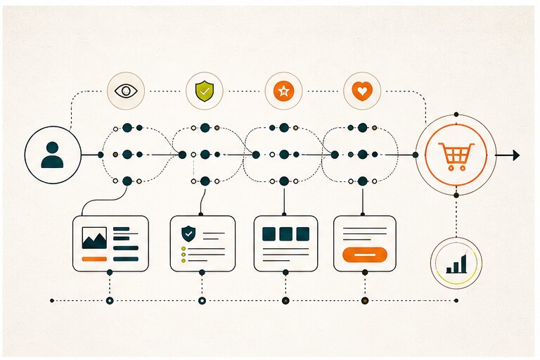
An annotated page example
Consider a hypothetical appointment-booking product for small service businesses. This is a layout exercise, not a measured conversion result.
| Section | Visitor question | What belongs there |
|---|---|---|
| Opening viewport | Is this for my business? | Plain-language offer, target user, and a clear demo or trial action |
| Workflow demonstration | How would this fit my day? | Three steps showing availability, booking, and confirmation, with accurate screenshots |
| Evidence | Why should I trust it? | Attributed customer evidence with permission, or a transparent product walkthrough when no customer evidence exists |
| Fit and limits | Will it work with my process? | Supported workflows, integration requirements, and meaningful limitations |
| Commercial details | What would I need to commit? | Clear pricing or quote requirements, setup responsibilities, and applicable terms |
| Objections and action | What is stopping me? | Specific FAQs and a repeated CTA after the information needed to decide |
Use the sequence as a hypothesis. A returning buyer may need pricing early; a first-time visitor may need a demonstration first. Move information based on observed tasks, not on a rule that every page needs these sections.
Test the viewport instead of designing to a fixed fold
- Open the page at representative narrow mobile, tablet, and desktop widths drawn from your audience where available.
- Test portrait and landscape, browser zoom, and larger text. Record what appears before scrolling.
- Check that the opening does not resemble a complete page when useful content follows. A visible next-section heading or partial card can signal continuation.
- Scroll using touch, keyboard, and a pointer. Check sticky banners do not cover headings, controls, or the final CTA.
- Repeat with real long headings and translated copy, not only short placeholders.
Responsive design changes layout to fit the available space. It does not guarantee that visitors will notice or understand the next section. Ask test participants to find an answer or complete a task and observe where they hesitate.
Measure useful engagement
Scroll depth shows exposure, not understanding or buying intent. Track a relevant task, such as reaching a booking confirmation or requesting a qualified demo, alongside section exposure and CTA use. Segment by device, landing page, traffic source, and new versus returning visits where the data supports that distinction.
For example, if visitors reach the integration section but cannot tell whether their calendar is supported, test clearer integration copy. Compare task completion and support questions before attributing a change to the section’s position. Longer visits can indicate either interest or confusion.
Collect only the analytics needed for the question and configure recording tools to exclude sensitive form values. Below-the-fold content can support a purchase decision, but placement alone does not guarantee higher revenue.
Should Call-To-Action Be Placed Below the Fold?
This is an essential topic to consider. Where should your CTAs be placed? Should they be in Below the fold section? This might be a complicated question as there is no exact answer. Start with what the visitor needs to know before taking that action.
1. Pre-sold Users: They are aware of what they want, so if you keep your CTAs on the above the fold section, this will be more helpful.
2. Interested Users: Your offer should be as straightforward as possible here, and you should explain to them how it gives them some value.
3. Uncertain Users: They need more time and content. If you ask them to buy quickly or sign up, they will avoid it.
Even if you group it this way, it is not as accurate as you think it might be.
We need to track the customers to know more about them properly. We should be aware of a customer’s pain points or which parts of our website are the most relatable for them. These can be achieved with the help of some specified tools for such things.
Tips for Improving the Design of Below the Fold Section
We have covered the importance of below the fold and more details on it. Lets now check some tips for improving the design of your website:
1- Give each section a purpose
Include enough detail to answer buying questions. Remove repetition and unrelated copy; use headings so readers can find specifications, delivery information, or limitations. Content length alone does not tell you whether a section is useful.
2- Don’t Use “False Bottom”
A false bottom means when a web page has some content in below the fold section but won’t let the customer know about it. Test whether visitors notice that the page continues before assuming the layout is working.
3- Put a Clue for Below the Fold
If you want your customers to know about below the fold section, just put up a clue or hint for your user. You can do this by adding a simple arrow or being creative and designing it your way.
4- Be Simple
The art of being simple and transferring your thoughts this way is essential. People do not want to give a lot of time to unclear content. They want to understand quickly, so they open your website and scan fast. That is your chance to attract them, so make sure to do that.
Conclusion
Being able to attract your customers is essential. Below-the-fold website sections are important because they give you space to explain, prove, compare, and guide users after the first impression. This is a great option to share your content with your customers and talk with them instead of pushing them to buy too early.
Use the next section of the page to answer the reader’s next question. If the journey needs a broader review, compare Hapy’s design and development engagements.