Web app conversion optimization should start before paid growth, not after the ad budget is already running. If the product journey is unclear, slow, hard to trust, or unable to get new users to first value, paid traffic will only make the waste easier to see.
The mistake is treating conversion as a marketing-page problem. For a web app, the real funnel continues after the click: signup, pricing, account creation, onboarding, first useful action, demo request, consultation booking, trial activation, and the first reason to return. A button-color test cannot fix a product journey that does not prove value.
The practical goal is simple: find where qualified demand turns into friction, then fix the product and signup experience before buying more demand. That means separating conversion from activation, reviewing analytics, watching real sessions, removing trust gaps, prioritizing experiments, and knowing when the bottleneck is deep enough to require refactoring or a rebuild. The user onboarding design guide focuses on the next step: moving a new user from signup to a measurable first useful outcome.
If the symptom is that users leave before understanding the offer, start with Hapy’s guide on why users leave a website. If the product flow itself needs evidence, pair this playbook with website usability testing and a focused UX audit. If the issue is internal workflow, handoffs, or data visibility behind the app, Hapy’s Business Systems & Automation work may be the better fit.
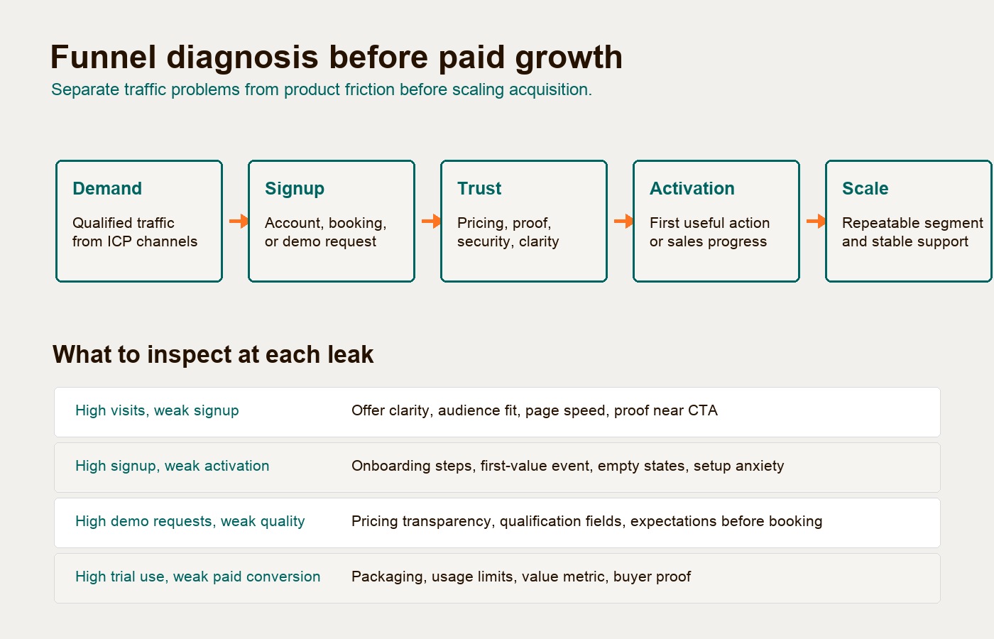
Conversion optimization is not the same as activation
Conversion records that someone moved through a business milestone. Activation proves that the right user reached product value.
That distinction matters because many teams celebrate the wrong event. A visitor who creates a free account has converted. They have not activated unless they complete the behavior that predicts future use: creating a first project, connecting a data source, inviting a teammate, booking a consultation, publishing a report, completing setup, or requesting a serious B2B demo with enough context for sales to qualify the account.
Appcues defines activation metrics as the moment users first experience real product value, not signup counts or login rates. Use that definition as a starting point, then validate the event against your own retention or sales data. Do not import a benchmark without checking its population, time window, event definition, and original study. That is why web app conversion optimization should measure what happens after the form submission.
For a SaaS signup flow, the activation event may be “created a workspace and invited one teammate.” For a consultation booking flow, it may be “submitted project context and attended the call.” For a trial product, it may be “connected the first integration and generated a useful output.” For a B2B demo request, the conversion is the form fill; the activation proxy may be whether the prospect supplies a real use case, budget context, or implementation timeline.
Use this first diagnostic pass:
| Funnel Stage | What It Measures | Weak Signal | Stronger Signal |
|---|---|---|---|
| Demand | Is the right audience arriving? | Page views from broad traffic | Qualified visitors from ICP channels |
| Signup or request | Are visitors willing to start? | Email-only account creation | Completed account, booking, or demo request with usable context |
| Activation | Did users reach first value? | Logged in once | Completed the action correlated with retention or sales progress |
| Trust | Do users believe the product and company are credible? | Generic testimonials | Transparent pricing, real proof, security clarity, third-party validation |
| Monetization | Is value clear enough to pay for? | Trial curiosity | Paid plan, pilot, deposit, or qualified sales opportunity |
| Expansion | Can this scale without breaking support? | One-off happy user | Repeatable segment, stable onboarding, manageable support load |
The table keeps the team from solving the wrong problem. If signups are low but demo quality is strong, the issue may be offer clarity. If signups are high but activation is weak, the issue is probably product friction. If activation is solid but paid conversion is weak, pricing, packaging, proof, or sales qualification may be the bottleneck.
Start with an analytics review, not opinions
A web app conversion review should begin with instrumented behavior. Without clean events, every debate turns into taste: sales wants fewer form fields, product wants better onboarding, marketing wants a sharper headline, and engineering suspects performance.
The first job is to define the core events:
| Event Group | Examples | Why It Matters |
|---|---|---|
| Acquisition context | Source, campaign, page, device, returning user | Separates paid traffic problems from product problems |
| Signup intent | Account created, email verified, plan selected, demo requested | Shows where anonymous demand becomes identified demand |
| Setup progress | Profile completed, role chosen, data connected, workspace created | Reveals whether onboarding asks for too much too early |
| First value | Report generated, task created, booking confirmed, automation run | Defines activation rather than relying on “logged in” |
| Friction and failure | Error click, rage click, dead click, timeout, validation error | Shows product and technical issues users may never report |
| Monetization | Trial started, checkout reached, plan changed, subscription created | Connects UX changes to commercial outcomes |
Manual event tracking gives the team a cleaner taxonomy, while auto-capture tools can help recover missed interactions and inspect historical flows. The choice matters less than discipline. Name events consistently, document properties, and segment by role, plan, company size, device, traffic source, and first session behavior.
Quantitative funnels show where the leak happens. Qualitative review explains why. Session replay, support tickets, sales-call notes, and usability tests are how teams avoid optimizing the wrong screen.
Use session replay only with a privacy boundary. Give users the notice and consent required for your context. Mask typed values and sensitive page elements. Never capture passwords, payment credentials, authentication tokens, or other sensitive information that the team does not need. Restrict access, set a retention period, and verify the recording vendor’s masking and sampling behavior in staging and production. If a flow cannot be recorded safely, use aggregate events, support evidence, or a consented usability session instead.
Datadog describes frustration signals such as repeated clicks, clicks that cause errors, and clicks that generate no action as ways to detect user pain that may not be reported directly. In practice, those signals are especially useful around signup, checkout, integration setup, pricing toggles, account creation, file upload, and multi-step onboarding.
Before enabling session replay, define which pages and fields may be recorded. Exclude passwords, payment information, private messages, customer records, and other sensitive content; verify masking with test sessions rather than assuming a default setting covers dynamic fields. Apply the required notice and consent controls for your context, limit staff access and retention, and check third-party processing arrangements. Use aggregate events or consented tests when replay cannot safely answer the question.
Do not watch random recordings for an afternoon and call it research. Filter permitted sessions by the moment of failure:
| Signal | What It Usually Means | What To Check First |
|---|---|---|
| Rage clicks | The user expects a response and does not get one | Slow API, frozen UI, disabled button, unclear loading state |
| Dead clicks | Something looks interactive but is not | Misleading styling, missing affordance, broken CTA, hidden state |
| Error clicks | The interaction throws an error | JavaScript exception, validation bug, unsupported device path |
| Repeated form edits | The user cannot satisfy the form | Field rules, unclear labels, password policy, phone/country format |
| Back-and-forth navigation | The user is comparing or confused | Pricing clarity, feature comparison, missing reassurance |
This turns “conversion optimization” into product diagnosis. You are no longer asking whether a page could convert better. You are asking which observed obstacle prevents the next high-value behavior.
Find the UX bottlenecks before you test copy
Analytics can show that people abandon a step. A UX review explains whether the step is cognitively heavy, visually misleading, technically fragile, or misaligned with the user’s mental model.
Nielsen Norman Group recommends having three to five people independently evaluate the same interface because one evaluator is likely to miss issues. For a web app funnel, keep the scope tight: signup, pricing, account setup, first value action, demo request, or booking flow.
The most conversion-critical heuristics are not decorative. They affect whether a user feels safe continuing:
| Heuristic | Web App Failure Mode | Conversion Impact |
|---|---|---|
| Visibility of system status | No loading state after submit, upload, payment, or save | Users click again, abandon, or assume the app is broken |
| Match with the real world | Internal labels, database terms, unclear plan names | Users cannot map the product to their own workflow |
| User control and freedom | No back, cancel, edit, undo, or safe exit in setup | Users avoid commitment because mistakes feel expensive |
| Consistency and standards | Different icons, terms, or patterns across product screens | Users relearn the interface instead of moving toward value |
| Error prevention | Validation appears only after submit | Users feel punished instead of guided |
A good friction inventory does not list every annoyance. It ranks issues by business consequence. The following rows, including the 38% drop, are illustrative examples, not measured Hapy results:
| Friction Item | Affected Flow | Evidence | Severity | Likely Fix | Owner |
|---|---|---|---|---|---|
| Email verification blocks product preview | SaaS signup | 38% drop between account creation and dashboard | High | Test a sample-data preview; retain verification before protected actions | Product + engineering |
| Pricing comparison hides implementation limits | B2B demo request | Sales calls repeat the same eligibility questions | Medium | Add “best fit” and “not a fit” plan guidance | Marketing + sales |
| Calendar booking asks for too much context | Consultation booking | Mobile users abandon long text field | Medium | Use structured dropdowns and optional detail field | Design |
| Integration setup fails silently | Trial activation | Error clicks and support tickets cluster on OAuth step | High | Add error recovery, retry state, and integration health checks | Engineering |
The severity score should combine frequency, impact, and persistence. A one-time wording issue on a secondary settings screen may be annoying. A silent failure during the first integration setup is a growth blocker.
The following table is an illustrative inventory, not a Hapy measurement. Replace the sample percentage with a result from a defined cohort, time window, and event definition before using it to set priority.
Trust and pricing are part of the product experience
Users do not separate product UX from trust. If the pricing page is vague, the signup flow feels manipulative, the demo form asks for too much personal data, or the dashboard contains rough edges, people infer risk.
NN/g’s credibility research names four durable trust factors: design quality, upfront disclosure, comprehensive and current content, and connection to the rest of the web. For web apps, those factors show up in practical places:
| Trust Factor | What It Means In A Web App Funnel |
|---|---|
| Design quality | Clean interface, readable hierarchy, no broken states, no raw technical errors |
| Upfront disclosure | Pricing, limitations, trial rules, cancellation, implementation steps, and data use are visible before commitment |
| Current content | Product screenshots, plan details, integrations, security notes, and help content match the actual app |
| External validation | Review profiles, security pages, case studies, client proof, partner pages, or credible third-party references are linked where relevant |
Pricing deserves special attention because it is where trust and qualification meet. CXL’s SaaS pricing page guidance emphasizes value-based packaging and clear plan comparison. The mistake is hiding the decision logic. If users cannot understand which plan fits them, they either delay, book an unqualified call, or leave to compare alternatives.
For a SaaS conversion flow, pricing should answer:
- What outcome does each plan support?
- What usage metric changes the price?
- What is included, limited, or excluded?
- What happens at the end of the trial?
- Who should talk to sales instead of self-serving?
For a B2B demo request, the form should qualify without interrogating. Ask enough to route the lead and prepare the conversation, but do not ask for every implementation detail before trust exists. For a consultation booking page, show what the call is for, who it is with, what the buyer should bring, and what happens after the call.
Strategic friction can improve conversion quality. CXL’s sign-up flow analysis compares friction-heavy, friction-deferred, and soft-registration models. The point is not that fewer steps are always better. The right question is where friction belongs. Low-risk exploration can happen early; sensitive data, payment, team invites, or complex setup can wait until the user understands why it is worth the effort.
Onboarding should shorten time to first value
Onboarding is not a product tour. It is the fastest credible path from intent to first value.
For SaaS conversion optimization, the onboarding goal is usually activation: the first event that predicts retention, paid conversion, account expansion, or sales progress. If the product has multiple personas, one activation path may not be enough. An admin, operator, analyst, and executive buyer may each need a different route.
Use this onboarding defect assessment:
| Time Thief | What It Looks Like | Better Fix |
|---|---|---|
| Empty dashboard | User lands in a blank state with no next step | Use sample data, templates, or one focused setup action |
| Premature configuration | Product asks for settings before value is clear | Delay advanced setup until after first useful output |
| Role ambiguity | Everyone gets the same onboarding checklist | Segment by role, company type, or use case |
| Integration anxiety | User must connect a sensitive system before trust exists | Explain permissions, show preview value, offer sandbox/sample path |
| No progress visibility | Multi-step setup gives no sense of completion | Add a short checklist tied to the activation event |
| No recovery path | A failed import, payment, or connection blocks the user | Provide retry, fallback, help, and clear error messages |
For a trial activation flow, that may mean letting users explore a mock report before connecting production data. For consultation booking, it may mean replacing an open-ended “tell us about your project” field with structured prompts. For a B2B demo request, it may mean routing high-intent prospects to calendar booking while sending vague or early-stage leads to a lighter discovery path.
The activation metric should be proven, not guessed. First define the eligible population and the retention outcome. Then compare eligible users who met that outcome with eligible users who did not, using the same acquisition period and event definitions. Inspect candidate first-week behaviors in both cohorts, and segment by role, plan, source, device, and product maturity where the data supports it. A difference is an association, not proof that the event causes retention. Validate the relationship with forward measurement or an experiment before making it the sole onboarding target. Then redesign onboarding around the best-supported behavior.
Prioritize experiments by impact, not loudness
Once the funnel is diagnosed, the team needs an experiment backlog. Without a scoring method, the backlog tends to follow the loudest stakeholder, the most recent sales call, or the easiest UI tweak.
Growth Method’s comparison of prioritization frameworks is useful because it separates simple methods like ICE from reach-aware methods like RICE and CRO-specific methods like PIE. Use the simplest framework that fits the team:
| Framework | Score Inputs | Best Use |
|---|---|---|
| ICE | Impact, Confidence, Ease | Small teams sorting early experiment ideas quickly |
| RICE | Reach, Impact, Confidence, Effort | Growth teams comparing ideas with different audience sizes |
| PIE | Potential, Importance, Ease | CRO teams prioritizing page or funnel improvements |
| PXL | Mostly binary evidence criteria | Mature teams reducing scoring subjectivity |
For web app conversion optimization, add one rule: score activation impact separately from signup impact. A change that increases account creation but lowers activation quality is not automatically a win.
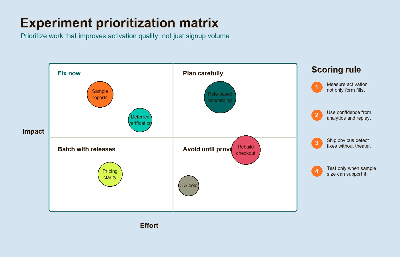
Here is a practical experiment table:
| Hypothesis | Metric | Reach | Confidence | Effort | Priority |
|---|---|---|---|---|---|
| Showing sample reports before integration will increase trial activation | Activation rate within 7 days | High | Medium | Medium | High |
| Moving pricing limits above the fold will improve qualified demo requests | Qualified demo rate | Medium | High | Low | High |
| Offering a sample-data preview before verification will increase qualified activation | Activated signup rate | High | Medium | Medium | High |
| Changing the primary CTA color will increase signup clicks | CTA click rate | High | Low | Low | Low |
| Adding role-based onboarding paths will improve first successful workflow completion | First value completion | Medium | Medium | High | Medium |
Do the math before launching tests. Statsig’s guide to minimum detectable effect explains why smaller detectable changes require larger samples and longer tests. If your app has low traffic, not every idea deserves an A/B test. Some fixes should ship because they remove obvious defects. Others should be measured with cohort analysis, usability testing, sales qualification, or before/after funnel review.
Know when optimization is really modernization
Some conversion problems cannot be solved with copy, layout, or onboarding. The web app may be slow because of outdated architecture. The pricing flow may be rigid because the billing model is hard-coded. The signup journey may be fragile because integrations, permissions, or legacy data models were never designed for self-serve onboarding.
This is where teams need to separate refactoring from rebuilding.
Refactoring changes the internal structure while preserving externally observable behavior. Performance work and feature changes may accompany it, but should have their own acceptance checks. It is appropriate when the funnel is mostly sound but performance, reliability, maintainability, or implementation quality is holding it back. A full rebuild is appropriate only when the current architecture prevents the product from supporting the business model.
Use this rebuild decision matrix:
| Question | Refactor First When… | Rebuild Or Replace When… |
|---|---|---|
| Is the affected flow central to revenue? | Downtime risk is high and targeted fixes can improve the path | The current flow cannot support the business model at all |
| Is the architecture understandable? | The codebase is messy but traceable | Business logic is undocumented, brittle, or tied to unsupported systems |
| Can the team improve the path in one to two cycles? | Signup, onboarding, or performance bottlenecks are localized | Every fix creates regressions across unrelated parts of the app |
| Does the data model support the offer? | Current data can support the pricing, permissions, and reporting model | The core model blocks plans, accounts, roles, billing, or automation |
| Can migration happen gradually? | A module-by-module replacement is possible | The old and new systems cannot coexist safely |
If replacement is necessary, avoid a dramatic big-bang rewrite where possible. Martin Fowler’s strangler fig application pattern describes gradually building a new system around the edges of the old one until the old system can be retired. For conversion work, that might mean rebuilding signup, pricing, onboarding, or reporting first while leaving the rest of the application stable.
A 90-day sequence before paid growth
Paid acquisition should begin only after the product has a defensible path from traffic to first value. The timeline below is an illustrative planning sequence, not a required waiting period or a guarantee that enough evidence will exist in 90 days. It does not require every system to be perfect. It requires the team to stop buying traffic into known friction.
| Phase | Focus | Work To Complete |
|---|---|---|
| Days 1-30 | Measurement and diagnosis | Define activation, clean event tracking, review funnels by source and segment, inspect replays around rage/dead/error clicks, interview retained and churned users |
| Days 31-60 | UX, trust, and pricing repair | Run heuristic review, fix high-severity friction, clarify pricing and trial rules, improve demo/booking forms, add proof near high-risk moments |
| Days 61-90 | Onboarding and experiments | Redesign first-value path, ship obvious defect fixes, prioritize experiments with ICE/RICE/PIE, calculate sample needs, decide whether refactor or rebuild is required |
For many teams, the best first paid growth move is not launching campaigns. It is raising the percentage of existing qualified visitors who reach first value. Once the funnel can turn demand into activation, paid growth becomes a scaling lever instead of a leak amplifier.
That is the real promise of web app conversion optimization: not more clicks, not prettier screens, and not shallow CRO advice. It is a cleaner path from interest to value, backed by evidence, so every new visitor has a fair chance to become a real customer.