A UX audit is a structured review of a product’s user experience that finds the workflow friction stopping users from reaching value, trusting the product, completing a transaction, or coming back. It is not a cosmetic checklist and it should not begin with “make the screens look modern.” The point is to identify the moments where the product is leaking activation, conversion, retention, confidence, or operational time.
For SaaS and MVP teams, this distinction matters. A product can look dated and still work. A product can look polished and still lose users because the onboarding asks too much too early, the fintech signup creates anxiety, the marketplace posting flow makes sellers start over, or the internal admin dashboard hides the one action an operator needs under pressure. When activation is the weak point, the user onboarding design guide shows how to define the milestone and shorten the path to first value.
The practical buyer question is this: do you need a focused product UX audit, a usability audit, a conversion UX audit, or a full redesign? The answer should come from evidence about the workflow, not from a visual preference debate. If paid acquisition is the next move, use the web app conversion optimization guide to connect audit findings to signup, onboarding, activation, pricing, and trust experiments.
This guide is written for founders, PMs, and product teams deciding whether to audit a SaaS product, MVP, marketplace, fintech flow, or internal admin system before spending serious budget on redesign or rebuild work.
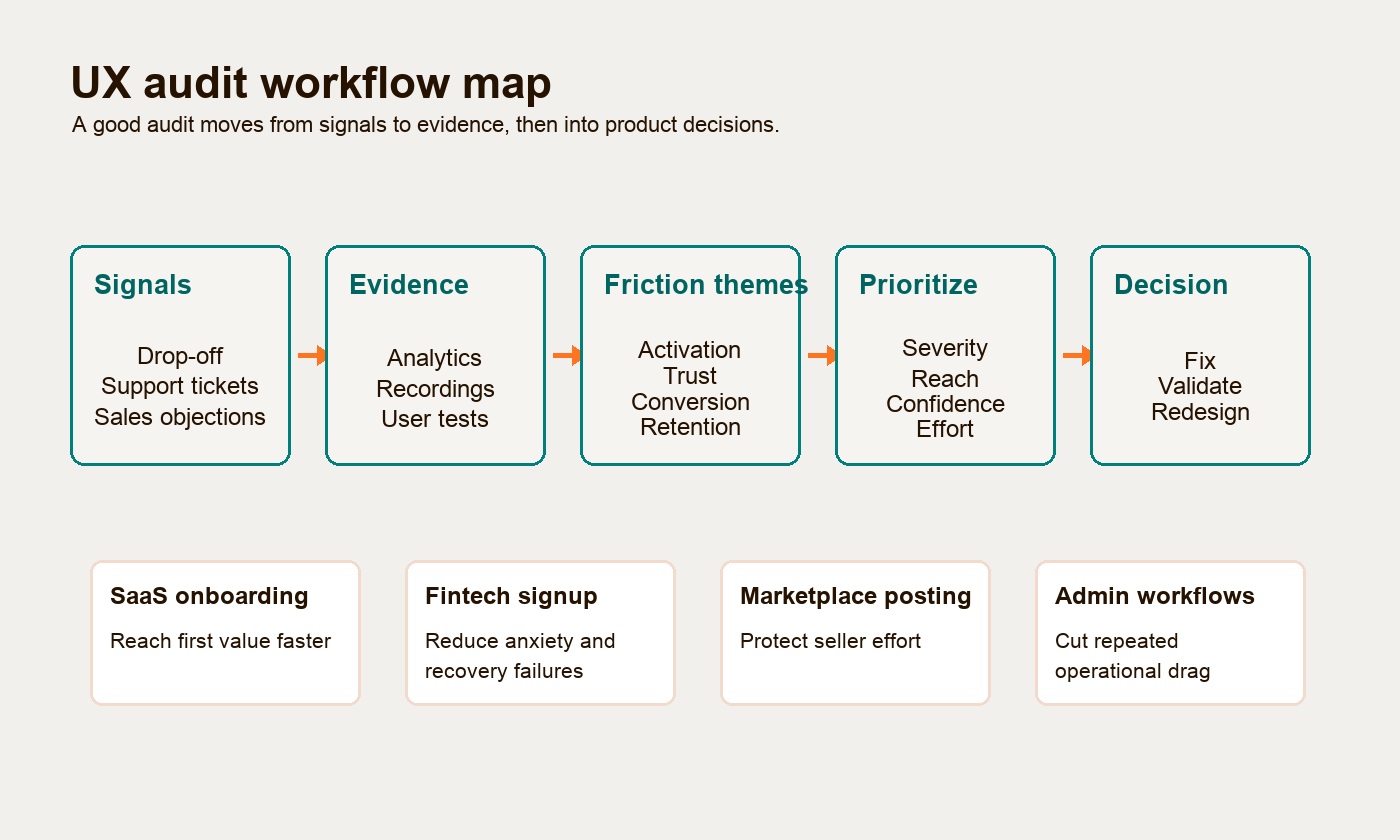
When to run a UX audit
Run a UX audit when the product has enough usage, sales feedback, or workflow evidence to diagnose friction. The best timing is usually before a redesign, before scaling paid acquisition, after a launch or pivot, or when a specific funnel step starts underperforming.
Good triggers include:
- Trial users sign up but do not reach the first meaningful action.
- Prospects like the promise in demos but hesitate when they see the product flow.
- Support tickets repeat the same setup, permissions, billing, or navigation confusion.
- A signup, KYC, checkout, posting, or configuration step has a visible drop-off.
- Admin users rely on spreadsheets, screenshots, or manual workarounds outside the product.
- The team is considering a redesign but cannot say which workflow problems the redesign must solve.
For an early MVP, avoid running a heavy audit before anyone has used the product. At that stage, the better work is usually product shaping, prototype testing, or a small usability review. Once a first version has real users or serious pilot conversations, an MVP UX review can explain why people stall, what needs to be cut, and whether the next build cycle should improve the existing flow or change the product shape.
For a growth-stage SaaS product, a SaaS UX audit is often most valuable when the team has dashboards and anecdotes that disagree. Analytics may show where users leave. Sales, support, and session recordings often explain why.
What a UX audit should review
A product UX audit should review the full task flow, not isolated screens. The audit should follow the user from intent to outcome and ask where the product creates delay, uncertainty, unnecessary work, or risk.
The core review areas are:
| Audit area | What to inspect | Business or workflow impact |
|---|---|---|
| Onboarding and activation | Signup, setup, empty states, guidance, first useful action | Trial-to-value, activation, early churn |
| Navigation and information architecture | Menus, labels, search, breadcrumbs, task depth, back behavior | Findability, support cost, task speed |
| Forms and data input | Required fields, validation, error recovery, autofill, save state | Completion rate, abandonment, rework |
| Trust and decision points | Security copy, pricing clarity, permissions, confirmation steps | Conversion, buyer confidence, risk tolerance |
| Accessibility and inclusion | Keyboard access, focus states, contrast, target size, semantic structure | Compliance exposure, reachable user base, quality |
| Performance and perceived speed | Loading states, table rendering, responsiveness, background jobs | Abandonment, operator throughput, trust |
| Design system consistency | Buttons, modals, tables, filters, states, patterns | Cognitive load, delivery consistency, engineering reuse |
| Operational workflows | Bulk actions, audit trails, exceptions, exports, permissions | Admin efficiency, error reduction, internal adoption |
This is where a UX audit overlaps with product design vs product development. Product design should clarify the workflow and interaction logic. Product development should make that workflow reliable, secure, and maintainable. A strong audit makes the handoff between those two disciplines less vague.
When the audit shows repeated component and state drift rather than one isolated usability problem, the next step may be a minimum design system for the startup instead of a broad redesign.
Data inputs that make an audit useful
A UX audit should combine quantitative and qualitative evidence. Quantitative data shows where friction appears. Qualitative data explains what the user thought, expected, feared, or misunderstood.
Useful quantitative inputs include funnel analytics, activation metrics, event tracking, time-on-task, validation error rates, search queries, support ticket volume, retention cohorts, rage-click or dead-click patterns, and page or app performance data. For web-based products, Google recommends judging Core Web Vitals at the 75th percentile across mobile and desktop, which matters because average performance can hide bad experiences for a meaningful share of users.
Useful qualitative inputs include user interviews, moderated usability tests, sales call notes, support transcripts, product demo recordings, stakeholder workshops, session replay review, competitive teardowns, and Jobs-to-be-Done notes.
The audit should not treat every input equally. A founder complaint, a designer preference, and a repeated user failure are not the same kind of evidence. Strong audits label the confidence behind each issue:
| Evidence level | What it means | Example |
|---|---|---|
| Observed behavior | Users or recordings show the issue directly | Four test users miss the same required step |
| Quantitative signal | Analytics show a measurable pattern | 37% of sellers abandon at photo upload |
| Repeated support or sales signal | Teams hear the same confusion often | Prospects ask why the admin role can see billing |
| Expert judgment | Evaluator flags likely friction from known heuristics | A destructive action lacks confirmation |
| Hypothesis | Plausible but not yet proven | A label may be too internal for new users |
The point is not to make UX feel scientific for its own sake. The point is to stop roadmap conversations from becoming a contest of opinions.
Heuristic review: useful, but not enough
A heuristic review is an expert walkthrough of the product against established usability principles. Nielsen Norman Group describes heuristic evaluation as a way to identify design problems by judging an interface against usability guidelines, and recommends that three to five people evaluate independently because one reviewer will miss issues another reviewer catches.
For a SaaS or MVP audit, the most useful heuristic review is task-based. The reviewer should not simply browse the app and list observations. They should attempt the important jobs a real user needs to complete:
- Create an account and reach the first useful outcome.
- Configure the first workspace, project, listing, payment method, or data source.
- Invite a teammate, assign permissions, or hand off work.
- Recover from an error or incomplete step.
- Find a record, filter a table, export data, or complete a repeated admin action.
The audit can use Nielsen’s 10 usability heuristics as a practical lens: system status, real-world language, control and freedom, consistency, error prevention, recognition over recall, flexibility, minimal design, error recovery, and help.
The caution is important: heuristic findings are not user research. They are informed diagnoses. If a high-stakes issue is unclear, test it with representative users before redesigning the whole product around it.
User testing validates the real blockers
User testing is where the product team watches representative users attempt real tasks. It is especially useful when the audit needs to explain why a metric changed, why users do not understand a flow, or whether a proposed fix actually improves the path.
For many product teams, small iterative tests are more useful than one large study. Jakob Nielsen’s well-known guidance is to test with no more than five comparable users per round and run repeated rounds after fixes, while testing more users when the product has distinct user groups. The lesson is not that five users magically proves everything. The lesson is that fast cycles of observation, repair, and retest usually beat one expensive research event.
A practical UX evaluation may combine:
- Moderated usability tests for core workflow failures.
- First-click tests for navigation and CTA uncertainty.
- Five-second tests for first-screen clarity and trust.
- Tree testing for information architecture and feature findability.
- Prototype testing before engineering commits to a new flow.
- Accessibility checks for keyboard navigation, focus visibility, labels, and screen-reader structure.
For website-heavy journeys, Hapy’s guide to website usability testing is a useful companion. For product workflows, the same principle applies: watch what people do, not only what they say they prefer.
UX issue severity matrix
Severity should connect user pain to product consequence. Nielsen’s severity model looks at frequency, impact, and persistence, then uses a 0-4 scale from “not a problem” to “usability catastrophe.” That scale is useful, but SaaS and MVP teams should add business impact so the roadmap reflects more than irritation.
Use this matrix to classify findings:
| Severity | UX meaning | Business/workflow impact | Example |
|---|---|---|---|
| 0. Insight | Not a usability issue, but useful context | May inform later strategy | Users prefer importing CSV before API setup |
| 1. Cosmetic | Irritating or inconsistent, but task still works | Low impact unless repeated across many screens | Button spacing differs between settings tabs |
| 2. Minor friction | Slows users down, but they can recover | Support questions, slower activation, mild frustration | Empty state explains nothing but the user can find the CTA |
| 3. Major barrier | Blocks or seriously delays a meaningful task | Conversion loss, repeated support, workflow avoidance | Seller loses listing draft after a mobile upload error |
| 4. Critical failure | Prevents completion, causes data loss, risk, or trust collapse | Launch blocker, compliance risk, revenue loss, operational failure | KYC step rejects documents without recovery path |
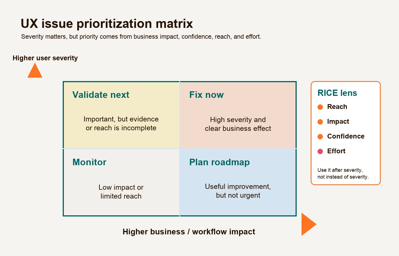
Severity is not the same as priority. A critical issue that affects one rare internal role may still wait behind a major issue that blocks every new customer from activating. Priority should combine severity with reach, business impact, confidence, and effort.
Examples across SaaS, fintech, marketplaces, and admin tools
The easiest way to judge a UX audit is to ask whether the findings are specific enough to change product decisions. “Improve onboarding” is weak. “Remove the company-size question from first-session signup, add SSO, and move team invitation until after first project creation” is useful.
SaaS onboarding: compress time to value
SaaS onboarding is where marketing promise meets product reality. The audit should inspect the distance between signup and the user’s first meaningful win.
Common friction:
- Long registration before the user understands the product.
- Product tours that explain every feature before the user has a task.
- Empty dashboards with no useful next step.
- Setup questions that serve sales or data hygiene more than user momentum.
- No save state when a user leaves midway through setup.
Better audit outputs tie each issue to activation. For example: “Workspace creation asks six questions before users can see the dashboard. Session recordings show hesitation on industry and team-size fields. Recommendation: reduce first-run setup to account, workspace name, and one goal; collect the rest after first value.”
Fintech signup: reduce anxiety without weakening compliance
Fintech signup has unavoidable friction because identity, risk, and compliance matter. A conversion UX audit should not recommend removing necessary KYC steps. It should identify where the product makes necessary friction feel suspicious, confusing, or unrecoverable.
Common friction:
- Sensitive data requests without plain-language rationale.
- Document upload flows that fail without telling the user what to fix.
- Progress indicators that do not show how many verification steps remain.
- Error copy that sounds like a system failure rather than a recoverable issue.
- No clear privacy, security, or regulatory explanation at the moment of anxiety.
The audit should separate legal requirement from UX debt. If the user must provide identity documents, the product still controls sequencing, microcopy, image guidance, progress save, retry design, and support escalation.
Marketplace posting: protect seller effort
Marketplace supply quality depends on sellers completing good listings. If posting is too hard, the marketplace gets fewer listings, weaker catalog data, and lower buyer trust.
Common friction:
- Category selection that uses internal taxonomy instead of seller language.
- Photo upload failures that erase listing progress.
- Required attributes that appear too late after the seller has already invested effort.
- Mobile forms with small tap targets or weak file handling.
- No draft autosave after interruptions.
For marketplace workflows, the audit should connect UX issues to liquidity. A seller who abandons a listing is not only a lost conversion. They may reduce buyer choice, search quality, and marketplace trust.
Internal admin workflows: reduce operational drag
Internal tools fail differently from consumer flows. Admin users may tolerate ugly screens if the workflow is fast, reliable, and complete. They become frustrated when the system creates repeated manual work, hides status, or makes errors hard to recover from.
Common friction:
- Dense tables without useful filters, saved views, or bulk actions.
- Background jobs with no progress, status, or failure explanation.
- Permissions that force operators to ask another team for routine changes.
- Export flows that require manual cleanup before the data is usable.
- Alert dashboards that treat every event as equally important.
For admin products, performance is part of usability. If a dashboard freezes under realistic data volume, the issue is not merely technical. It changes whether operators trust the tool during real work.
Audit deliverables buyers should expect
A good UX audit should leave the team with decisions, not only screenshots. The deliverables need to be readable by executives, actionable for PMs, useful for designers, and specific enough for engineering.
| Deliverable | What it should contain | Who uses it |
|---|---|---|
| Executive summary | The highest-impact friction themes, business risk, and recommended path | Founder, CEO, VP Product |
| Evidence map | Analytics, recordings, support notes, user quotes, heuristic findings, and confidence level | PM, researcher, designer |
| Annotated flow review | Screenshots or prototype frames with issue notes, severity, and recommendations | Product design, content, frontend |
| UX issue backlog | Problem statements, affected users, severity, reach, confidence, effort, and owner | PM, engineering lead |
| Prioritized roadmap | Quick wins, planned fixes, validation tasks, and redesign candidates | Product and engineering |
| User testing plan | Tasks, participants, success criteria, and what needs validation | Research, PM, design |
| Redesign decision memo | Whether to fix, redesign, or overhaul, with reasons and tradeoffs | Leadership and delivery team |
The best audit output is boring in the right way: clear, evidence-backed, and easy to turn into work.
Prioritization framework: severity plus RICE
After the audit, the team needs a practical way to decide what happens next. RICE is useful because it compares reach, impact, confidence, and effort instead of relying only on opinion. Intercom’s original RICE model defines reach as the number of people affected in a period, impact as the effect on each person, confidence as certainty in the estimate, and effort as person-months or similar team effort.
For UX audit findings, adapt RICE like this:
| Factor | UX audit version | Example question |
|---|---|---|
| Reach | How many users, accounts, transactions, or operators hit this issue? | Does this affect every new signup or one admin role? |
| Impact | What happens when the issue occurs? | Does it delay, confuse, block, risk data loss, or reduce trust? |
| Confidence | How strong is the evidence? | Do we have analytics, recordings, tests, or only expert judgment? |
| Effort | What design, engineering, QA, data, or compliance work is needed? | Is this copy, component reuse, workflow redesign, or backend change? |
Then group the backlog into three buckets:
| Priority bucket | When it fits | Example |
|---|---|---|
| Fix now | High reach, high impact, strong confidence, low to moderate effort | Preserve form data after validation errors |
| Validate next | Potentially important, but evidence is incomplete | Test whether new users understand workspace roles |
| Redesign candidate | High impact but high effort, often tied to workflow or system constraints | Rebuild KYC verification flow around saved progress and review states |
This prevents a common mistake: treating every severe issue as an immediate rebuild mandate. Sometimes the right move is a one-day copy and validation fix. Sometimes the right move is a deeper product design audit that changes the whole workflow.
When a UX audit should lead to redesign
A UX audit should lead to redesign when the friction is structural, repeated, and expensive enough that small fixes will only move the problem around. It should not lead to redesign just because the interface looks old.
Targeted fixes are usually enough when:
- Users understand the workflow but trip on specific labels, states, or validations.
- The product has one or two leaky funnel steps with clear causes.
- The design system is mostly consistent.
- Engineering can fix the issue without changing the underlying workflow or data model.
A UX redesign may be justified when:
- The core journey has too many steps, handoffs, or hidden decisions.
- Users repeatedly misunderstand the product’s main mental model.
- The design system is fragmented enough to slow every new feature.
- Mobile, accessibility, or responsive behavior breaks important workflows.
- The current product no longer matches the company’s positioning or buyer expectations.
A deeper overhaul may be necessary when:
- The workflow depends on a broken data model or permission structure.
- Performance fails under realistic usage.
- Operators maintain shadow systems because the product cannot support real work.
- Compliance, accessibility, or security gaps are built into the foundation.
Accessibility deserves special treatment here. WCAG 2.2 Level AA includes measurable requirements such as 4.5:1 contrast for normal text and a 24 by 24 CSS pixel minimum target size for many pointer inputs. If a product misses these patterns across templates, the fix may need design-system and frontend work, not scattered screen edits.
The same is true for performance. Google’s current Core Web Vitals focus on Largest Contentful Paint, Interaction to Next Paint, and Cumulative Layout Shift, with page experience judged at the 75th percentile. If an internal admin table, onboarding dashboard, or checkout flow feels slow at realistic data volume, design polish will not solve the user’s trust problem.
What a buyer should ask before hiring for a UX audit
Before buying a UX audit, ask whether the partner can connect interface findings to product and business decisions.
Good questions:
- Which workflows will you audit, and why those?
- What data will you review before making recommendations?
- Will findings include severity, evidence level, reach, effort, and business impact?
- How will you distinguish cosmetic issues from workflow blockers?
- Will you validate major findings with users or only expert review?
- What will the team receive: annotated screens, backlog items, prototypes, roadmap, or redesign brief?
- How will recommendations account for engineering constraints?
- When would you recommend not redesigning?
That last question matters. A trustworthy product design audit should protect the buyer from unnecessary rebuild work. If the audit partner treats every finding as proof that the product needs a full redesign, they are selling design hours, not product judgment.
The useful outcome: a smaller, sharper next move
A UX audit is valuable when it helps the team choose the smallest responsible next move. That may be a tighter onboarding flow, clearer fintech verification steps, a safer marketplace posting experience, a better admin dashboard, a focused usability test, or a full redesign brief.
The test is simple: after the audit, can the team say which friction points matter most, who they affect, what evidence supports them, how much effort they require, and whether the fix should improve activation, trust, conversion, retention, or workflow speed?
If yes, the UX audit has done its job. It has turned a vague design concern into a product decision.
If you are still deciding whether the problem is usability, positioning, or the product itself, Hapy’s guides to why users leave a website and product design vs product development can help separate surface symptoms from deeper workflow and build decisions.